service-pipeline-documentation
How to read the Methylseq report - basic analysis
Zymo Bioinformatics 07 September, 2021
- Overview of the pipeline
- Report overview
- General Statistics
- Cutadapt
- FastQC (trimmed)
- Bismark
- Insert Size
- CpG Coverage
- Genomic Region Coverage
- Bismark (spike-in)
- Samtools (spike-in)
- MethylDackel (spikein)
- Download
- Summary and Software Versions
Overview of the pipeline
The report was generated with our Methylseq Basic Analysis pipeline built on nextflow platform. A example report can be found at here.
The backbone of the pipeline is as follows:
-
Input reads trimming by Trim Galore.
-
Reads quality assessment by FastQC.
-
Reads alignment by bismark.
-
Methylation calling by MethylDackel.
-
Library insert size distribution by picard.
-
Read coverage per cytosine by bedtools.
-
Library quality metrics using Zymo In situ Spike-in Control.
-
Generating downloadable files.
Report overview
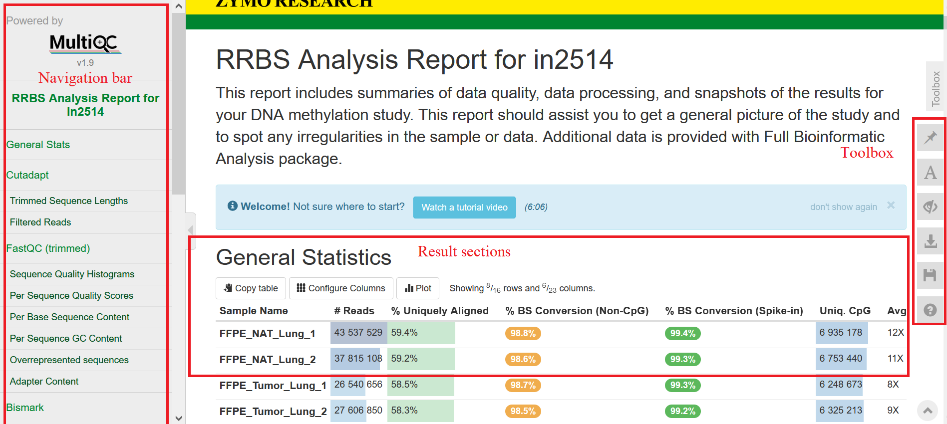
This bioinformatics report is generated using MultiQC, which is integrated into the nextflow pipeline. There are general instructions on how to read a MultiQC report at here, or you can watch this video. In general, the report has a navigation bar to the left, allowing to quickly navigate to any section in the report. Next to it on the right are result sections, which are interactive: hovering mouse over or clicking these tables/figures will lead to more details. On the right edge, there is a toolbox that allows to customize the appearance of the report and export figures and data.
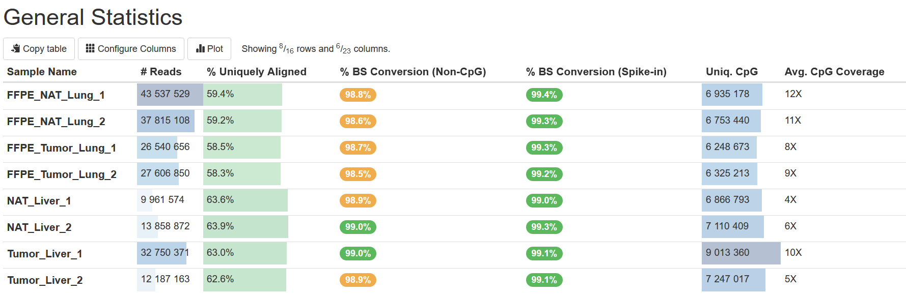
General Statistics
The table General Statistics provides some import statistics of the data. Here are some you can use to assess the data:
-
% Uniquely Aligned This is the percentage of total uniquely aligned read pairs (or reads in single-end sequencing) to the target genome. In general, the higher the percentage, the better. The value however varies among sample types and library protocols. The total number of reads is shown in column
# Reads. -
% BS Conversion (Spike-in) This is the bilsulfite (BS) conversion rate computed based on the reads derived from our Zymo In situ Spike-in Control. The Spike-ins consist of 6 DNA fragments with known CpG methylation levels, so their measured methylation levels can be used to compute on BS conversion rates.
-
% BS Conversion (Non-CpG) This metric provides another measurement on BS conversion rates, calculated as 1 minus the average methylation level in the CHG and CHH contexts, assuming no methylation at all in those two contexts. However, the assumption may not be valid in some circumstances such as in plant, so a BS conversion rate from Spike-ins is a better estimate.
-
Uniq. CpG This is the number of CpG cytosines in the genome covered by reads.
-
Avg. CpG Coverage This is the average number of reads covering each cytosine as reported in the
Uniq. CpGcolumn. Please also refer to the section CpG Coverage for the counts of cytosines at different read coverage levels.
Cutadapt
TrimGalore internally calls cutadapt to trim low-quality bases and
adapters from reads. This section presents the results of trimmed
fragments and the remained reads after trimming and filtering.
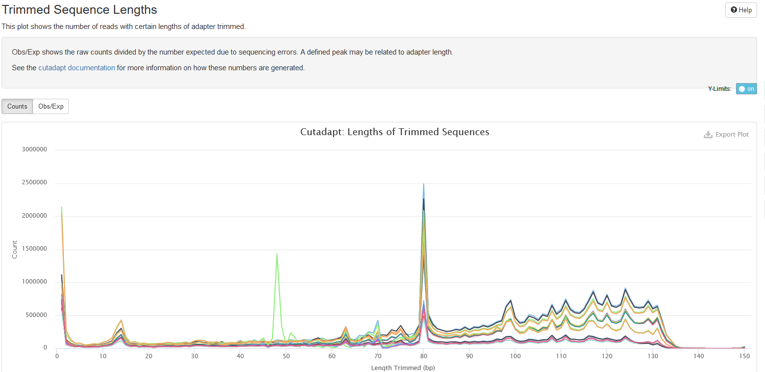
Trimmed Sequence Lengths
In this plot, the x-axis shows the length of each trimmed fragment (the part discarded), and the y-axis shows the number of reads for each case. Normally, the number drops quickly as the lengths of trimmed segments increase, because for most reads, only a few bases are derived from adapters or of low quality. For RRBS, however you may see some peaks in the middle because of short library insert sizes.
The tab Obs/Exp presents the ratio of observed and expected counts for
a given trimmed length. The expected count is computed by assuming
sequencing error only. A ratio higher than 1 indicates that some trimmed
segments are true adapters. One can see cutadapt’s
guide
for more explanation.
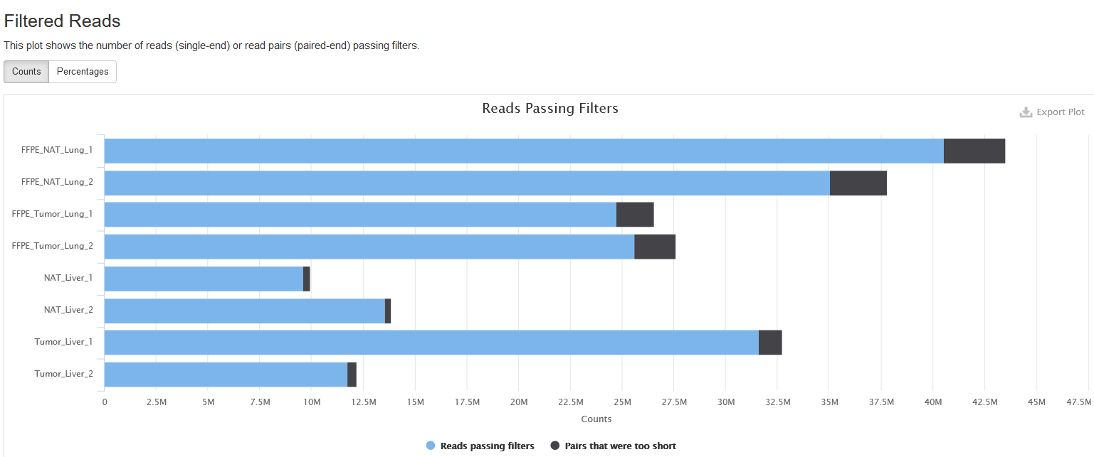
Filtered Reads
In this plot, it shows the number of reads passing the filtering of TrimGalore. TrimGalore trims low-quality bases and adapters from the 3’end of each read and filters out reads that are shorter than 20bps. And in the paired-end mode, both reads in a pair are discarded if either of them is shorter than 20 bps, and this is why the read1 and read2 files of one sample always have the same number of filtered reads.
For RRBS sequencing, the option --rrbs for TrimGalore is on to remove
filled-in bases at read ends introduced during library preparation. For
more details on how TrimGalore removes the filled-ins, please refer to
the TrimGalore
Manual.
One can toggle the tabs between Counts and Percentages to view the numbers and percentages of filtered reads, a feature available for most plots in the report.
FastQC (trimmed)
This section shows the FastQC analyses run on trimmed fastq files. FastQC is a tool to analyze library qualities by examining the metrics such as base qualities, GC content, overrepresented and adapter sequences. A warning is issued if any metric fails.
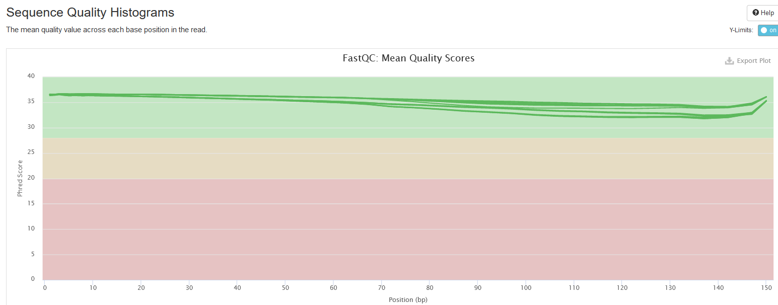
Sequence Quality Histograms
This section shows the average Phred quality scores per base along read length. Normally, the base quality decreases towards 3’end. This provides information on whether 3’end quality trimming is needed.
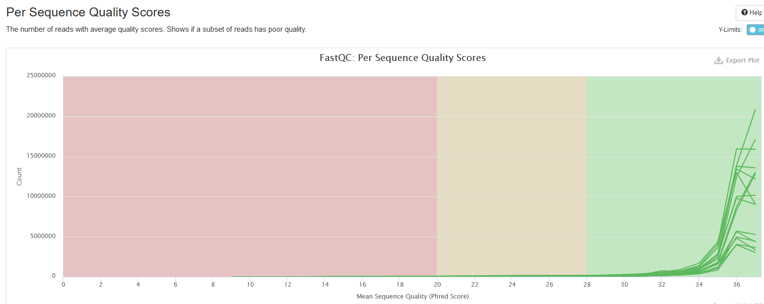
Per Sequence Quality Scores
This plot shows the distributions of read sequence quality, computed by averaging the Phred scores of all bases in a read. It is expected that peaks are at values > 28; if you see peaks at lower values, it is a warning sign of low quality libraries.
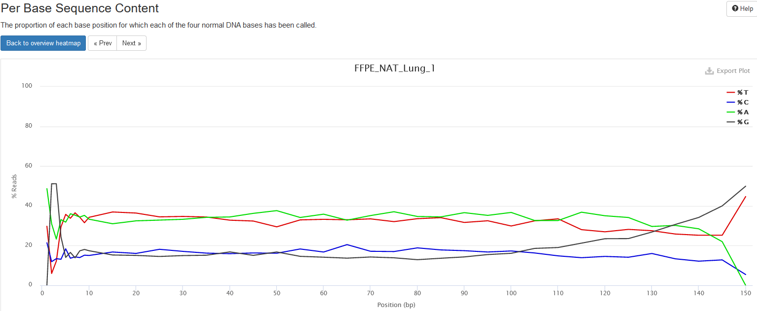
Per Base Sequence Content
This plot shows the percentages of the four nucleotides (A, T, C, G) at each read position; each base is in different color. The heatmap shows average base compositions with samples as rows and positions as columns. When hovering mouse over the plot, the nucleotide compositions are shown at top of the plot.
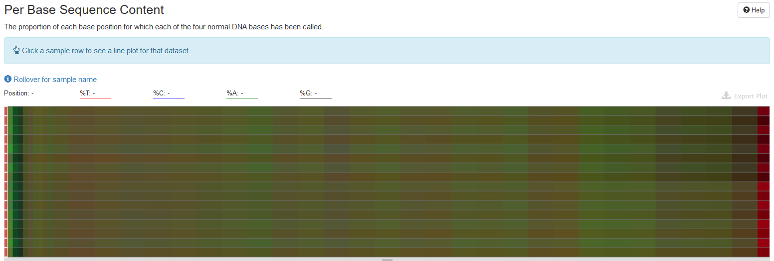
One can click on one row/sample to have a detailed view on how nucleotide composition changes over read length. The composition is expected to be even over read length.
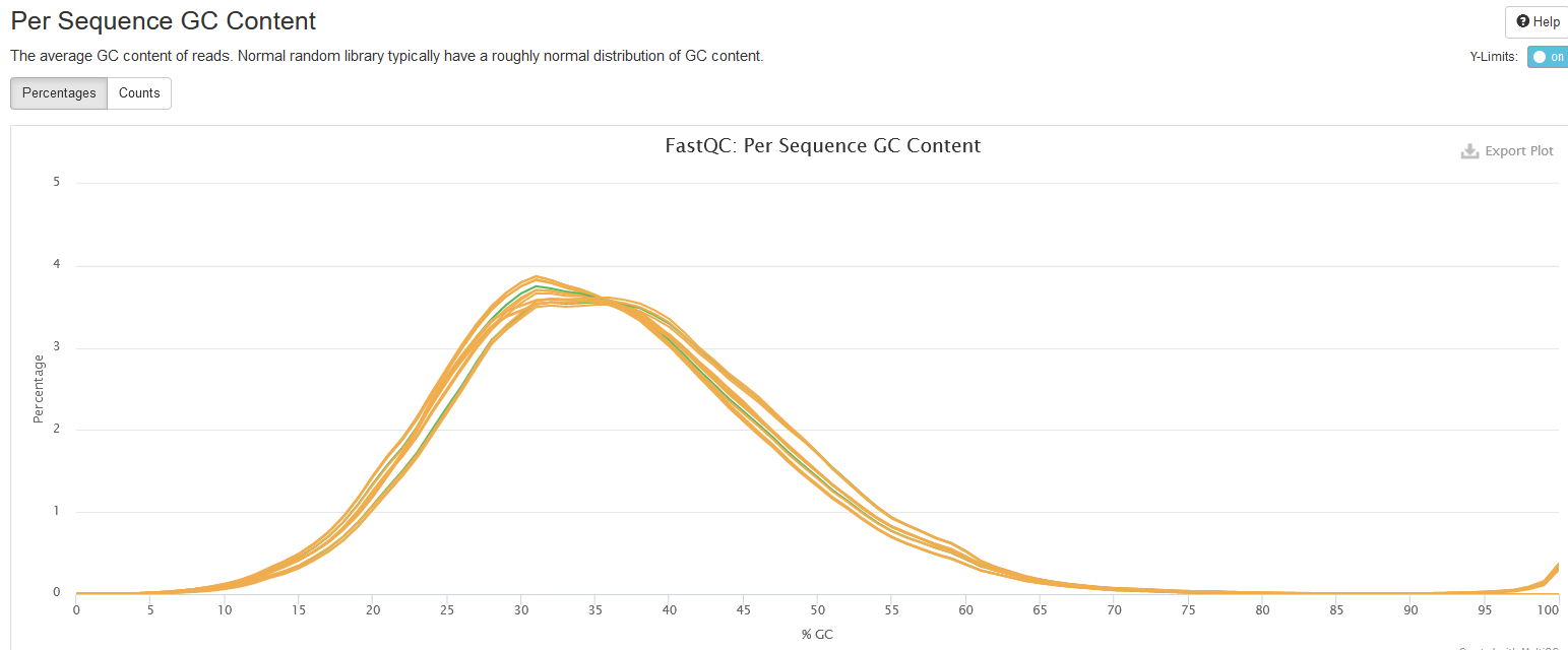
Per Sequence GC Content
This plot shows the distributions of reads’ GC content, that is, the percentages of G and C nucleotides in a read.
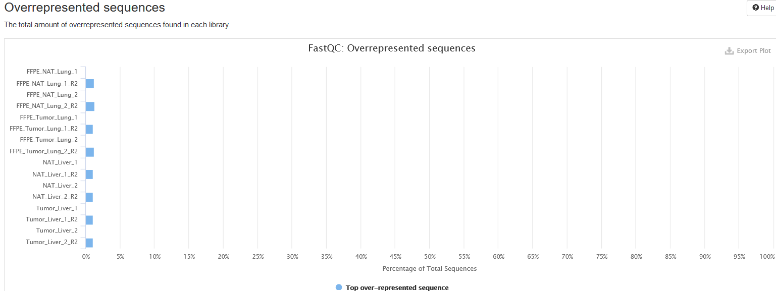
Overrepresented sequences
If there are overrepresented sequences, such as contamination, enriched fragments, or duplicated reads, this section will show the frequencies of the top representative sequences (frequency > 0.1%).
Adapter Content
This plot shows the percentage of reads containing an adapter sequence at each base position cumulatively, so if a read contains an adapter at a position, then this read is counted for all subsequent positions.
When running this analysis on already trimmed sequences, one expects to see no adapters, as displayed here.

Bismark
Bismark is a tool to align bisulfite-converted sequencing reads to a genome. One can find the manual of the program at here.
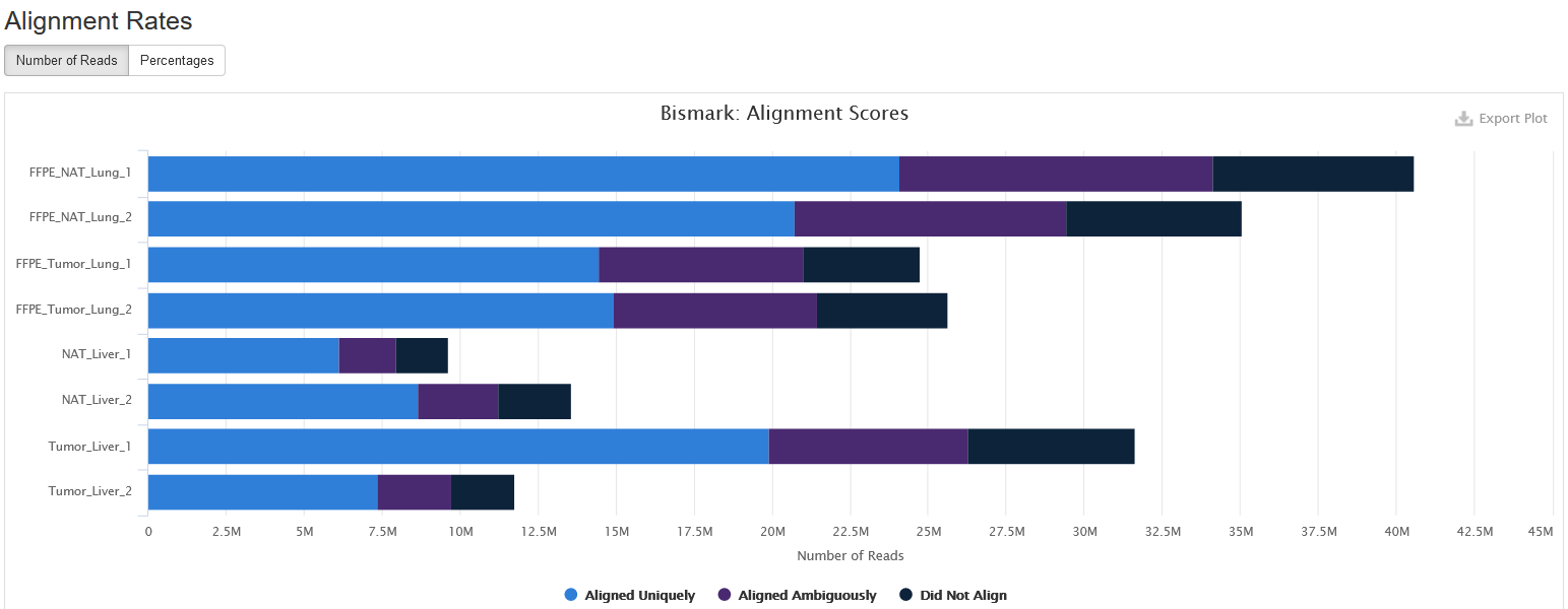
Alignment Rates
This plot shows the number and percentage of reads in each of the following categories:
-
Aligned Uniquely: reads that are mapped to a unique genomic position.
-
Aligned Ambiguously: reads that are mappable to multiple genomic positions.
-
Did Not Align: reads that are not alignable to the genome.
For downstream analyses such as calling methylation, only Aligned Uniquely reads are used.
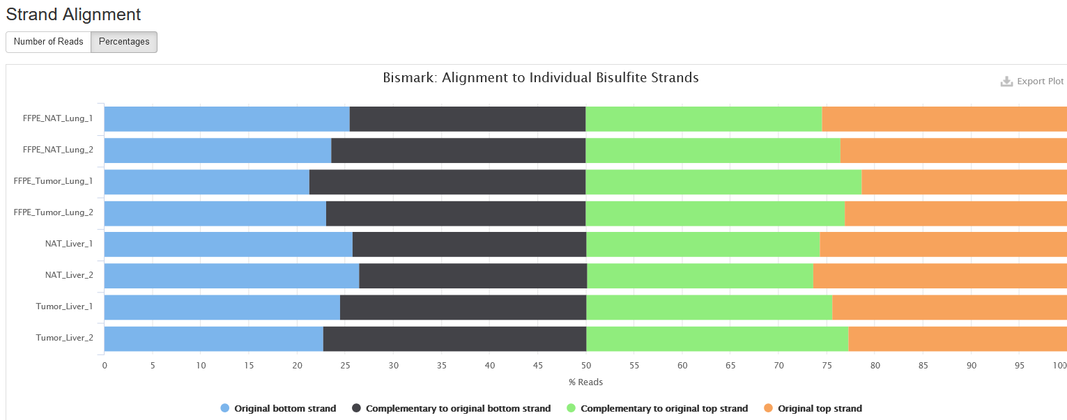
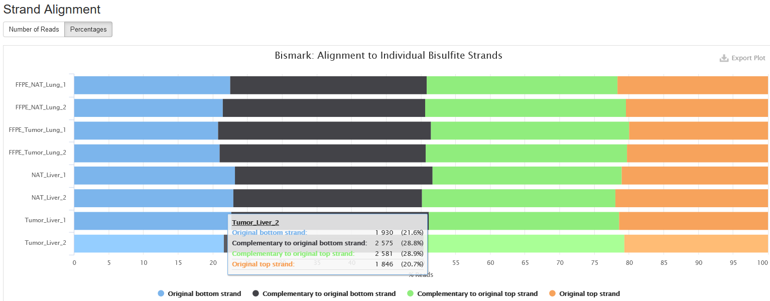
Strand Alignment
This plot shows which strand each read pair is aligned to. Due to bisulfite conversion, there are four strands that a read pair can align:
-
Original top strand: the top/Waston strand.
-
Complementary to original top strand: the strands complementary to the top/Waston strands, generated through PCR.
-
Original bottom strand: the bottom/Crick strand.
-
Complementary to original bottom strand: the strand complementary to the bottom/Crick strand, generated through PCR.
For a directional sequencing library, you may only see reads from original top and bottom strands, but for non-directional one, you will see reads from all four strands.
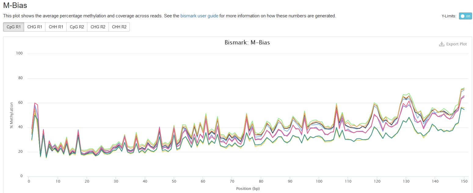
M-bias
This plot presents the methylation values along base positions in a read. The methylation value is computed by averaging the methylation values at a position across all reads in a sample. Normally, one expects the methylation value stays constant along base positions.
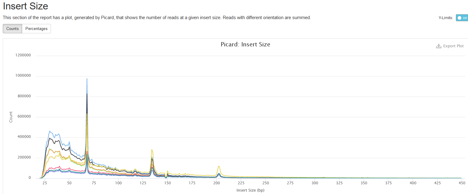
Insert Size
This shows the distribution of estimated insert sizes for each sample. For RRBS, one may see multiple spikes in the range from 40 to 220 bps due to MspI digestions (see explanation here).
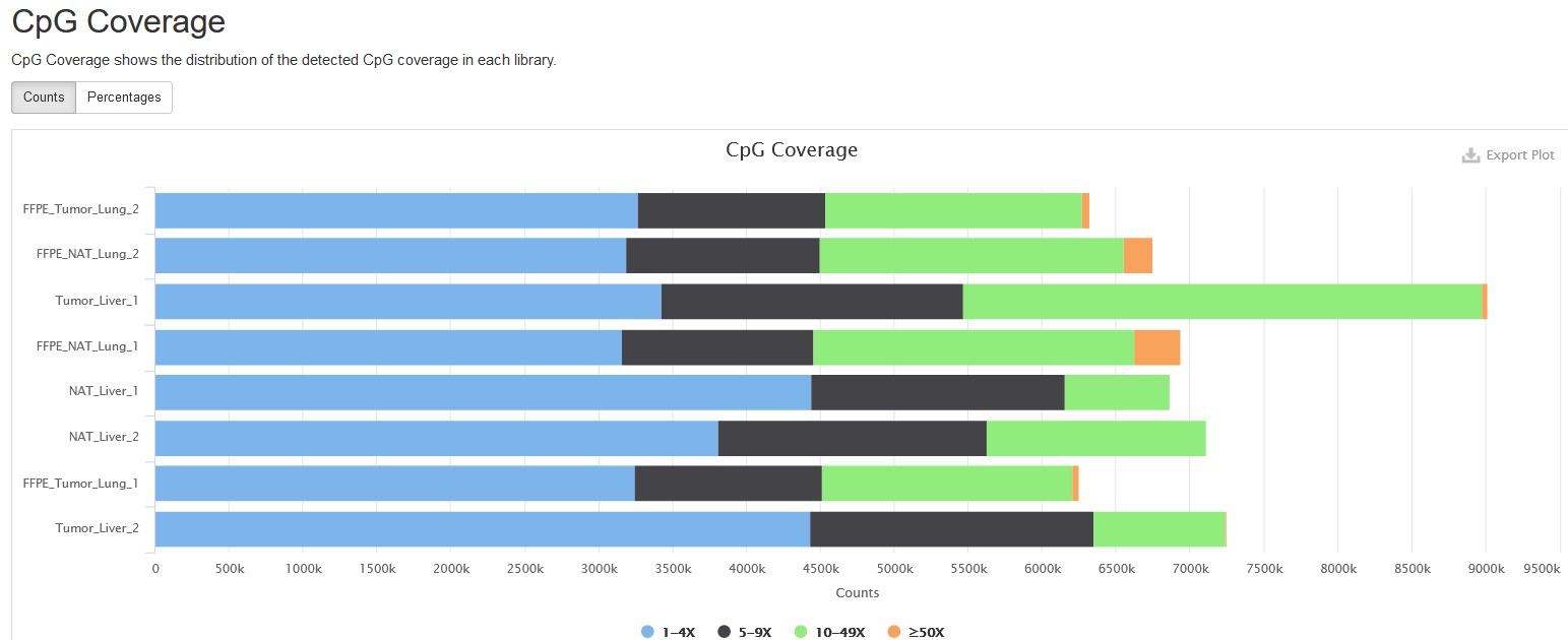
CpG Coverage
This plot presents the number and percentage of cytosines in CpG context under different read coverages. Here, only cytosines covered by at least one read are considered. For easy visualization, the read coverage (aka. read depth) is divided into four ranges: 1-4, 5-9, 10-49, >=50.
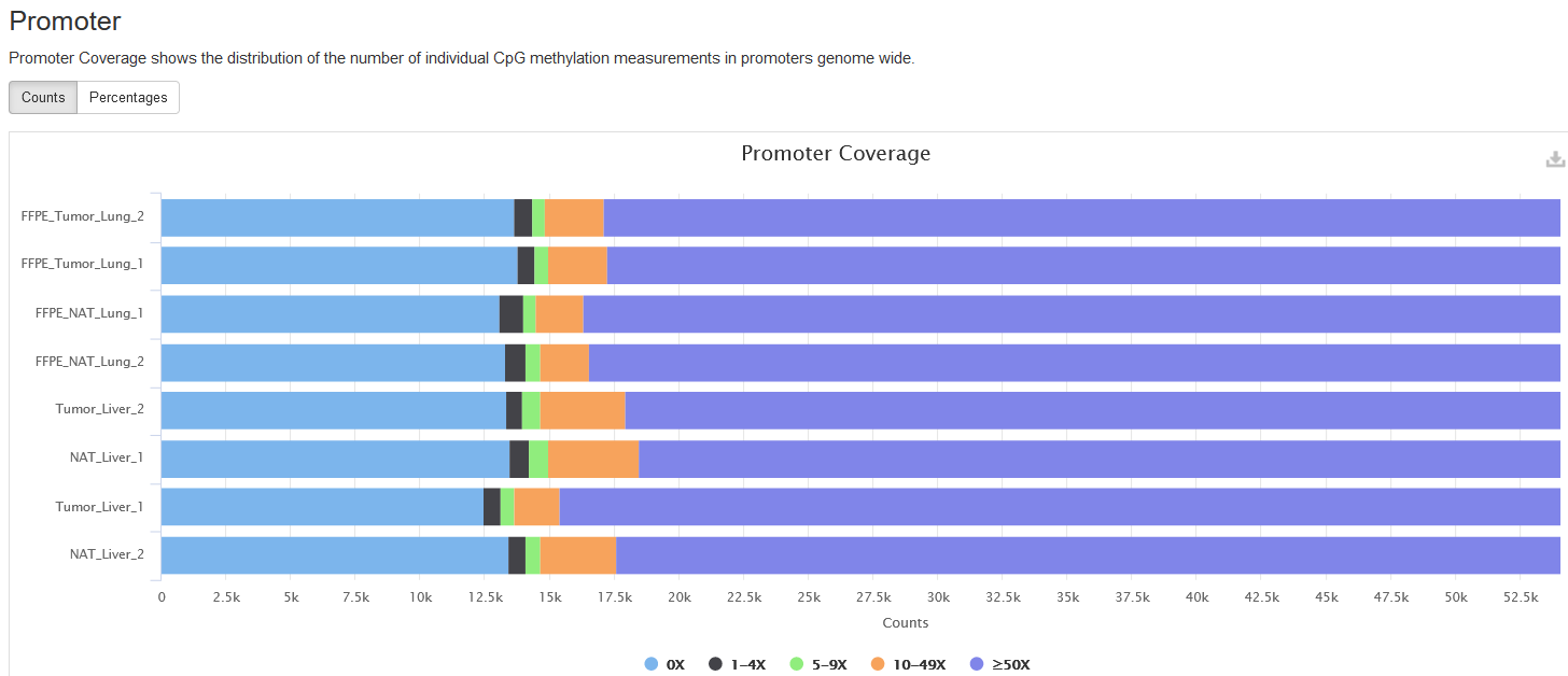
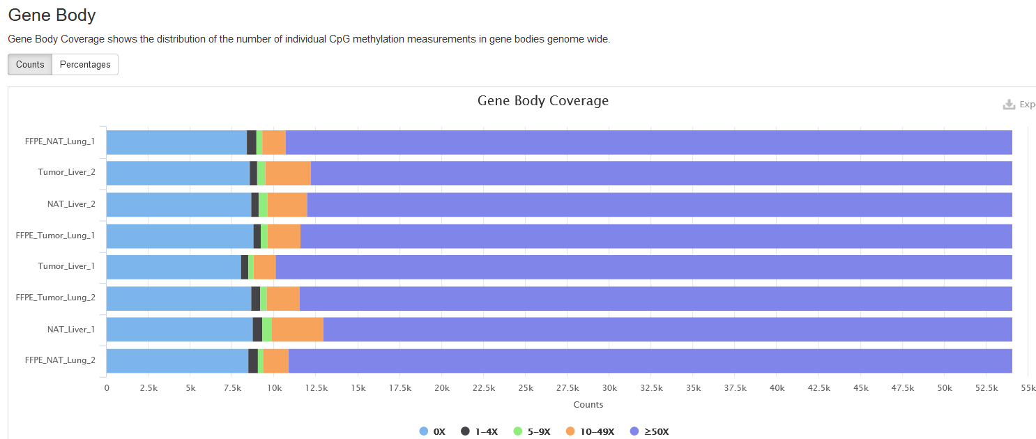
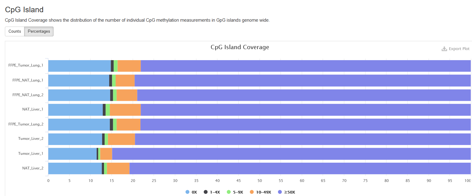
Genomic Region Coverage
This section presents the number of reads mapped to each functional region. At present, we consider the following functional regions: gene body, CpG island, and promoter. Following the procedure in this paper, the coverage in a region is calculated as the number of measurements on CpGs in the region.
Promoter
Promoter is defined as the 2000-bp region upstream of a gene start.
As you can see, the coverages are divided into ranges based on their
coverage levels. You can also toggle between Counts and Percentages
tabs.
Gene Body
Gene body is the genomic region from a gene’s first base to last, so both exons and introns are included.
CpG Island
CpG islands are clusters of CpGs and often defined operationally. Here, we use the definition by Gardiner-Garden M and Frommer M., and use the max scoring algorithm to identify them. More on the CpG island criteria can be found at UCSC.
Bismark (spike-in)
Strand Alignment
This section shows the numbers of reads aligned to spike-in sequences in each sample. Similar to the plot for mapped-to-genome reads, the alignments to each strand are separated.
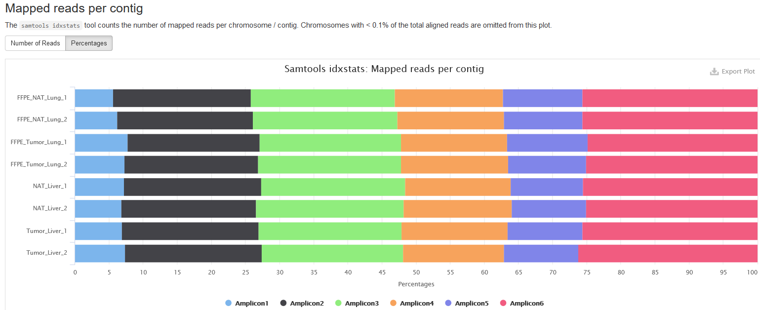
Samtools (spike-in)
Mapped reads per contig
Similar to the preceding section, but the alignments are categorized based on the spikein sequences, namely amplicons. There are totally 6 amplicons.
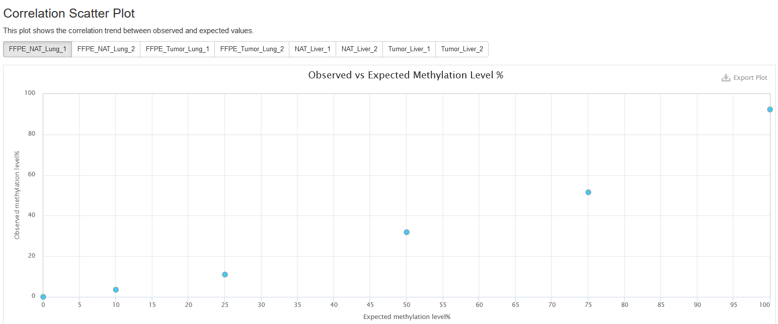
MethylDackel (spikein)
In this section, we show the correlation between observed and expected methylation values for the spikein sequences. The observed methylation values are extracted from bam files using MethylDackel, and compared to the known/expected methylation values for each spikein sequence. A significant deviation of observed methylation values from expected ones can be a sign of incomplete bisulfite conversion, among other issues.
Correlation Scatter Plot
This subsection presents a correlation plot of expected (x axis) and observed (y axis) methylation values for all spikein sequences. The points are expected to fall around a slope line of 45 degrees.
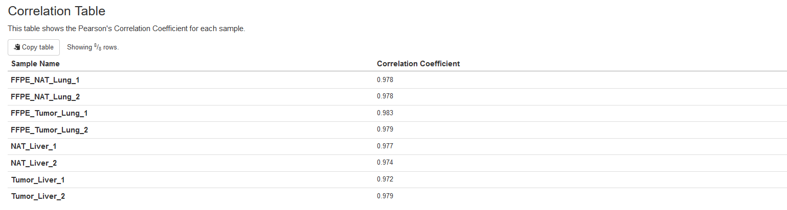
Correlation Table
This table presents the Pearson correlation coefficients between the expected and observed methylation values for spikein sequences, which are more quantitative measurements than the aforementioned correlation plots.
Download
This section provides links to all kinds of downloadable data that the pipeline generated.
Note that the links are valid for a limited time (default 90 days).
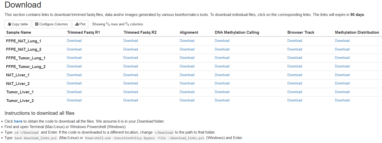
The data content of each file type is explained below:
-
Trimmed Fastq R1: Read 1 fastq files after trimming by TrimGalore.
-
Trimmed Fastq R2: Read 2 fastq files after trimming by TrimGalore.
-
Alignment: Bam files generated by bismark.
-
DNA methylation calling: Bedgraph files containing the numbers of reads supporting methylation and nonmethylation for each cytosine in the genome. These files are generated with MethylDackel.
Each file has 6 columns (separated by tab) as follows:
- The chromosome name.
- The start coordinate of a cytosine on the chromosome.
- The end coordinate of a cytosine on the chromosome.
- The methylation percentage rounded to an integer.
- The number of reads/pairs reporting methylation status.
- The number of reads/pairs reporting nonmethylation status.
One can find more information on the format by checking the MethylDackel page.
-
Browser Track: The UCSC browser tracks in bigbed format. One can view these files directly in the UCSC browser. An instruction on how to view bigbed files in UCSC custom tracks can be found here.
-
Methylation Distribution: Figures displaying methylation value distributions in functional regions, including CpG islands, gene bodies, and promoters.
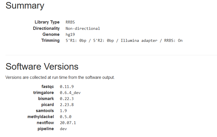
Summary and Software Versions
This section shows some parameters used in data analyses, such as library type, genome assembly, etc.
The software versions used in the pipeline are also listed.